The main photo should invite the customer browsing through search results to make a click and view the product listing. Once they’re on the product page, the additional, secondary pictures should entice them to make a purchase, converting that click into a sale.
Here are some best practices to follow when creating product photos for Amazon.
1. Follow Amazon’s guidelines for main images.
Before you get creative with your images, make sure you familiarize yourself with Amazon’s image guidelines. The main image must be on a plain white background and only be of the product that is being offered with no additional props. These images must not contain any copy unless it has been added internally by Amazon to indicate pack size. This enables Amazon to offer customers a clean, consistent online experience when browsing.
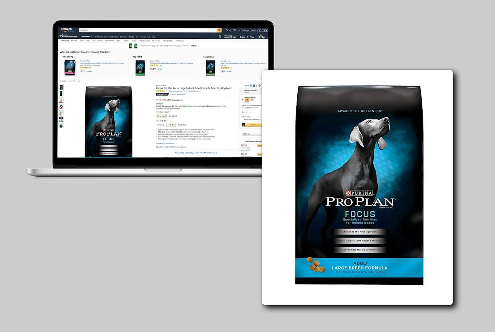
2. Use mobile-ready hero images.
According to GS1, it’s important to optimize your main product image for presentation on small screens. With mobile-ready hero images, it’s easy for customers to look at the product and immediately see who the brand is, what it is, which variety it is, and how much of it there is. This helps customers who are browsing through search results on mobile easily determine if the product is right for them without having to read the title. Make sure this information is clear on the pack itself. Don’t forget Amazon’s guidelines, which state that no copy should be added to the main image.
3. Get creative with additional images.
You can use up to eight additional images for desktop and six for mobile. Although on desktop only seven images show as thumbnails, the other two appear if the buyer clicks on the image gallery. Amazon is more strict on the main image than the secondary images; sellers and vendors have more freedom to customize these, though there are guidelines to be aware of. Brands should use this space to show lifestyle images and product packaging shots, highlight key features, and sell the product to the best of their ability. Remember the customer is not in a store where they can pick up the product and read the packaging.
4. Show what’s in the box.
While the packaging sometimes has an image of the actual product, always include additional photos that show the item outside of its package. The customer wants to know what the actual product looks like, not just the packaging. For some items it may be obvious, such as laundry detergent, but with food products it is less so.
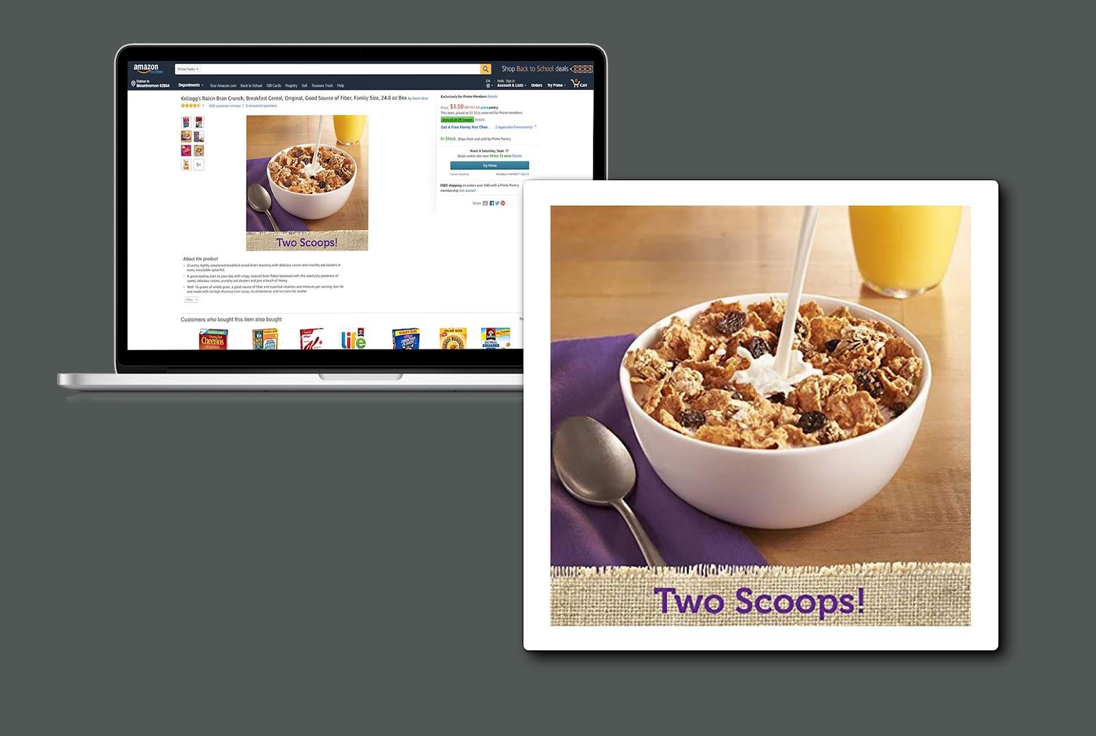
5. Highlight key features.
While text cannot be added to the main image, it can be added to the additional images if used correctly. Consider using custom creatives to call out important features and benefits. Avoid relying on the copy on the front of the package in the packshot. This is appealing to the customer who can pick up the item in a store but not to the customer looking at the product online.
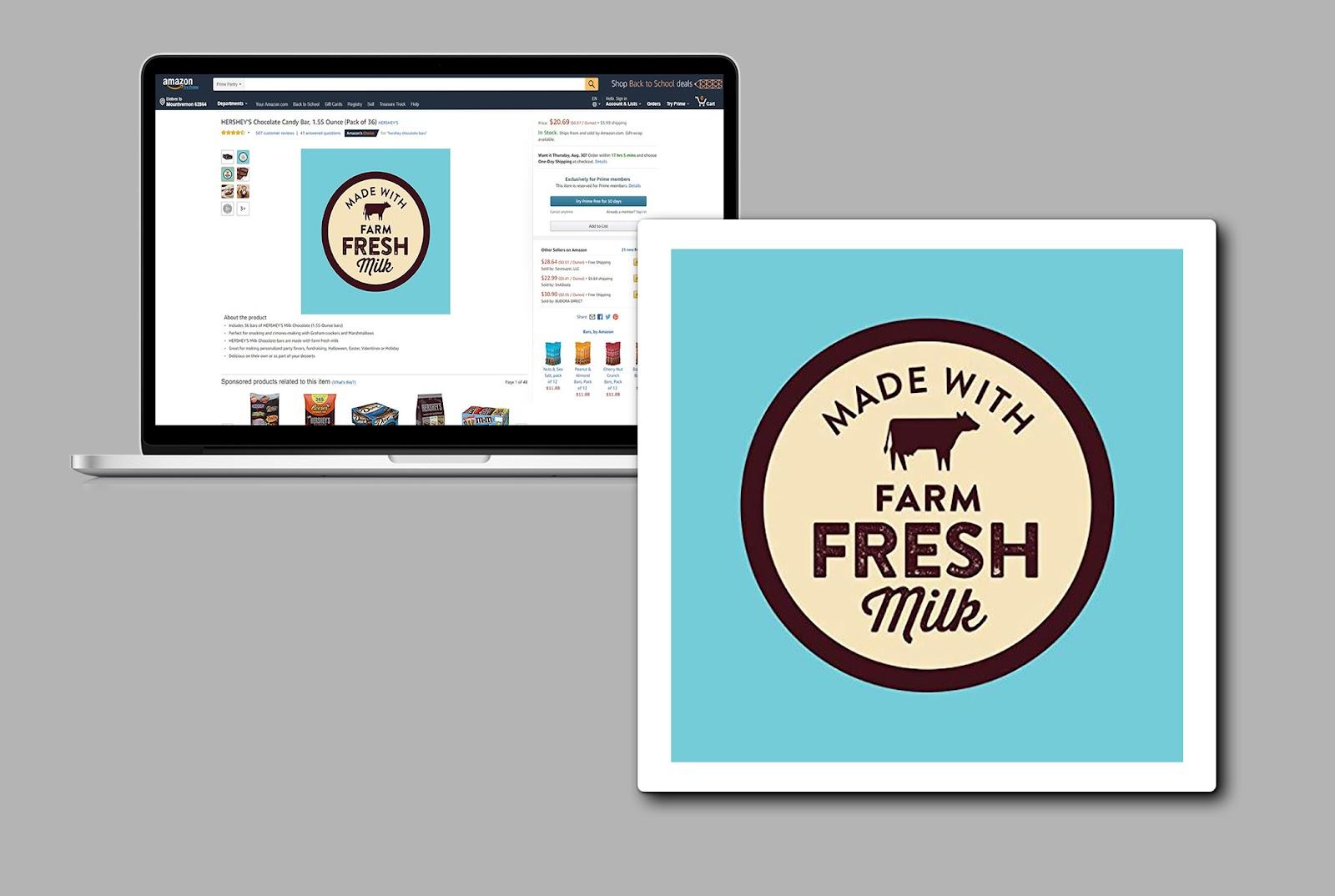
6. Incorporate lifestyle imagery.
Customers like to visualize using a product. Lifestyle graphics and images of the item in use help the customer relate to the product and understand it better. These images can also be a lot more appealing and exciting to look at.
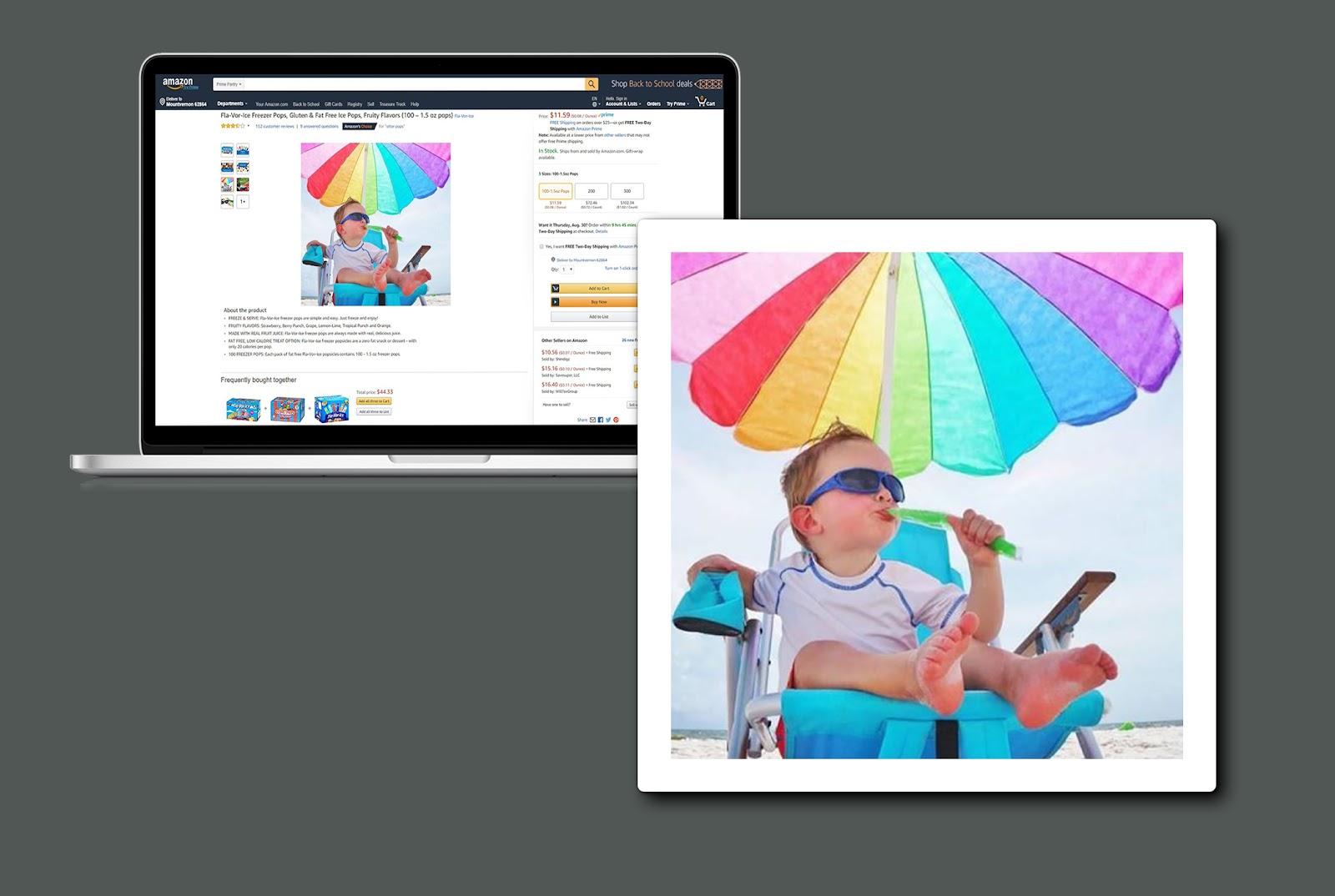
7. Be mindful of image size.
Nothing is more frustrating for a customer than trying to read the details on the package but not being able to because the writing is too small and there is no zoom option. Make sure the images are at least 1,000 pixels on the longest side to allow the zoom function to work.
8. Don’t neglect image quality.
All images need to be clear and not blurry. Images that contain key information such as ingredients and nutrition facts need to be easy to read. Use custom creatives instead of basic packshots; this can make the images more compelling to the customer.
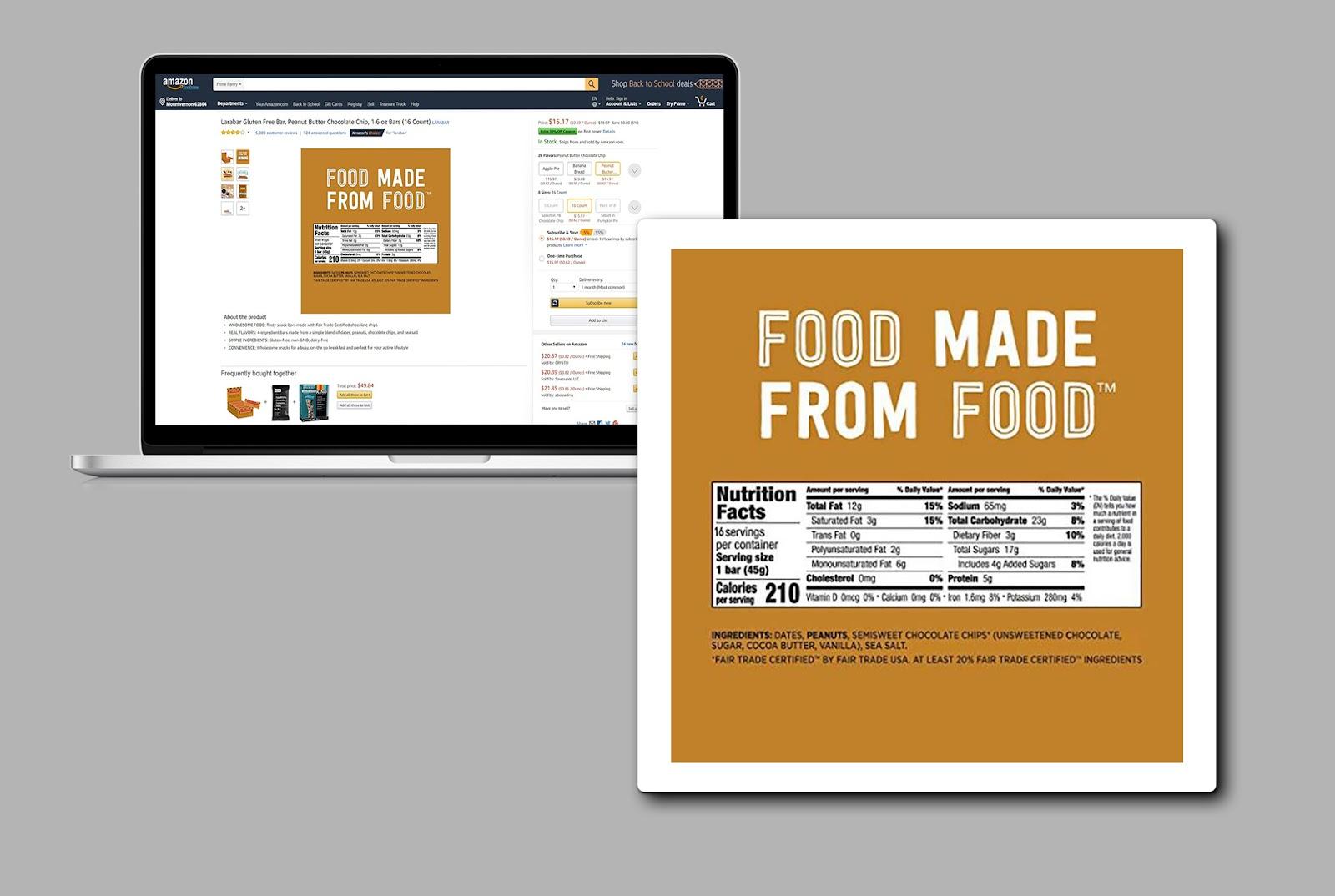
9. Make sure it’s the exact product.
The customer must receive the exact item that appears in the product images. If the customer doesn’t receive the item with the exact same specifications or feels misled in any way, they will be quick to write a negative review and return the item. Even if the packaging has changed but the product remains the same, the image must be of the same packaging the customer receives.
Conclusion
Photos are one of the most important components of an Amazon product page. Not only can quality, professional-looking images boost clicks and sales, but their premium look can warrant brands increasing their prices slightly. The customer sees the quality of the images and knows that it comes at a cost.
Brands should not only ensure their images clearly showcase the front and back of the package, but they should also invest in high-quality custom creatives that highlight key features and benefits and showcase the product in use.
Ready to grow your business?
Let's discuss the best approach to meet your brand's specific needs.
Let's connect


